Crackpots, geniuses, and how to tell the difference

Crackpots, geniuses, and how to tell the difference:

Over at Download the Universe, Ars Technica science editor John Timmer reviews a science ebook whose science leaves something to be desired. Written by J. Marvin Herndon, a physicist, Indivisible Earth presents an alternate theory that ostensibly competes with plate tectonics. Instead of Earth having a molten core and a moveable crust, Herndon proposes that this planet began its existence as the core of a gas giant, like Jupiter or Saturn. Somehow, Earth lost its thick layer of gas and the small, dense core expanded, cracking as it grew into the continents we know today. What most people think are continental plate boundaries are, to Herndon, simply seams where bits of planet ripped apart from one another.

The problem is that Herndon doesn’t offer a lot of evidence to support this idea.

Once the Earth was at the center of a gas giant, Herndon thinks the intense pressure of the massive atmosphere compressed the gas giant’s rocky core so that it shrunk to the point where its surface was completely covered by what we now call continental plates. In other words, the entire surface of our present planet was once much smaller, and all land mass.

I did a back-of-the-envelope calculation of this, figuring out the radius of a sphere that would have the same surface area as our current land mass. It was only half the planet’s present size. Using that radius to calculate the sphere’s volume, it’s possible to figure out the density (assuming a roughly current mass). That produced a figure six times higher than the Earth’s current density — and about three times that of pure lead. I realize that a lot of the material in the Earth can be compressed under pressure, but I’m pretty skeptical that it can compress that much. And, more importantly, if Herndon wants to convince anyone that it did, this density difference is probably the sort of thing he should be addressing. He’s not bothered; the idea that the continents once covered the surface of the Earth was put forward in 1933, and that’s good enough for him.

Herndon’s book came out with the help of a vanity publishing house and Timmer uses it as an example of why peer review is important—it forces scientists with interesting ideas to actually present evidence and go through a process of answering questions about and explaining holes in that evidence. Even though peer review can be flawed, it’s a much better system than not having any kind of vetting process available.

I noticed something else here, as well: The similarities in the way different kinds of badly done science often work. Even though Herndon can’t present evidence supporting his theory, he can tell a good story about it. If I’m honest, the idea that, once upon a time, Earth was a gas giant is pretty appealing. As a story. It makes our planet seem more impressive. It gives a sense of a secret history known only to a few. It connects to familiar sounding things: Gas giants and Earth. And, if you don’t know all the astronomical background that Timmer does, it sounds plausible.

That reminds me of something Pesco posted about recently: Creationist textbooks that teach kids that the Loch Ness Monster might be a surviving dinosaur and therefore evolution must be wrong. I learned high school biology from one of these textbooks. (In fact, that such arguments exist is one of those facts I have forgotten is not widely known information. My reaction when Pesco posted that story was to think, “Oh, right. I guess most of our readers don’t know that already, do they?”)

In a lot of ways, the Loch Ness Monster hypothesis is a lot like Herndon’s Gas Giant Earth hypothesis. They both have storytelling appeal, especially a great sci-fi hook. They both offer access to secret knowledge. They both propose a connection between familiar ideas—a tactic that makes these hypotheses seem more accessible to lay people than the ideas they propose to replace. They both do a lot of hand-waving and mumbling when you start asking questions about the details.

I think that it can be legitimately really hard to tell the difference between science and pseudoscience. We want to know about the world around us. We often need scientific data to make useful decisions in our lives. But we can’t just go out and do all the research ourselves because we have other stuff to do. We’re each busy with our own area of expertise and don’t have time to become experts in every question we’re ever going to need an answer for. Specialization of labor is a bitch like that. At a certain point, we have to trust people who are experts in a given field to tell us what they’ve learned.

So how do we know who to trust?

I don’t think I have a perfect answer for that, but looking at books like Herndon’s and those Creationist biology texts, I have a couple suggestions:

1) If it makes a really nice story, ask for the details. (Good science usually makes a bigger deal out of the evidence than it makes out of the story. In fact, that’s actually a problem many legit scientists have—they’re better at talking about the details and data then they are at telling stories. But most of us respond to stories better than we respond to details and data.)

2) If the proof seems self-evident (i.e., it’s just good common sense), ask more questions.

3) If believing the idea will make you smarter than the official experts, be suspicious. Experts aren’t always right. But they do know their fields and experience does matter. Chances are, you’re an expert in something. Say you knew how to bake pies really well. You’d be pretty suspicious if somebody who didn’t bake (or didn’t even really cook much) told you that you were making pies all wrong—and that they had a secret pie recipe that was better than yours. They might be right. It’s worth taking a look at their evidence. But it also worth being skeptical.

4) If the studies used to prove it are really old, or if there’s only a few of them, dig deeper. What looks like truth when you look at five research papers can very quickly become completely untrue when you look at 500. What sounds like a good idea when presented by it’s originator can turn out to be terrible when you talk to a few other people. Try to get a sense of what the bulk of evidence is saying.

5) If you’re told you can’t trust any other sources of information (especially because of Big Conspiracy, or because so-and-so expert is a bad person in other areas of his or her life), be cautious. Replication is a powerful tool. It helps us get past accidental and intentional biases to see something closer to the truth. Suppressing replication is also powerful, because it leaves you with no way to check against bias.

Obviously, all these rules come with caveats. But I think they’re a good place to start.

Read John Timmer’s full review of Indivisible Earth at Download the Universe


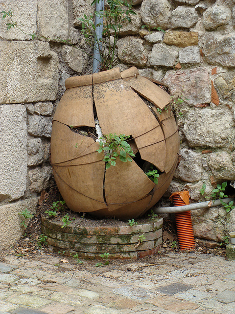
Image: Cracked pot, a Creative Commons Attribution (2.0) image from bonitalabanane’s photostream


Leaf Paintings by Brad Kunkle

Leaf Paintings by Brad Kunkle:
Leaf Paintings by Brad Kunkle painting
Artist Brad Kunkle lives and works in New York where he paints these extraordinary, dreamlike scenes of women swathed and shrouded in layers of leaves. The leaves often form the backdrop of his images functioning as water, wind, blankets, earth or perhaps all of the above. Via Arcadia Fine Art:

Brad was searching for an unnatural quality in his paintings, and it was ironically discovered by reducing his processes to the elements of painting he felt came most natural to him. His minimal palette is inspired by the grisailles of early European masters and the haunting quality of antique photographs and daguerreotypes. “Grisaille has a mysterious quality to it, and that mysterious quality is also at times carried into the way I will treat an object or a dress. Sometimes I like to give just enough information for the viewer to finish the details of what they are seeing.”

Brad had his most recent solo show at Arcadia Fine Art back in April, and is currently working on a new body of work that will be shown at the LA Fine Art Show in 2013.

Tunes, in Drops of Color: Design Project Mixes Minimal Notes with Audible Hues

Tunes, in Drops of Color: Design Project Mixes Minimal Notes with Audible Hues:

Perhaps it’s the sense of detachment that comes from long hours spent staring at screens, peering into pixels and abstraction. But whatever the reason, when experimenting with design and music, creators seem increasingly drawn to simple, physical interaction. Somewhere in the mysterious play between senses, between seen color and unseen sound, they look for intuitive relationships.
Designers Hideaki Matsui and Momo Miyazaki send in the latest adventure in induced synesthesia. Students at the Copenhagen Institute of Interaction Design, they use a camera to connect color to sound.
audible color from Momo Miyazaki on Vimeo.
Full description:

Audible color is an audio-visual instrument. Sound is generated based on color detected by a web cam connected to a computer. Red, green and blue correspond with certain music notes. When the colors are mixed, the resulting secondary colors produce different notes. The size of the colors influences the volume and frequency of the notes played. Color detection and sound generation were created and are controlled using Processing code.
The system of audible color is based on a marriage between basic color and music theories. The colors of red, blue, and green are the visual foundation for color-mixing and the music notes A, D, and F are the base triad that corresponds to the colors. The secondary colors (colors made when the foundational three are mixed) of purple, teal and brown are tuned to the musical triad C, E and G. The visual of the mixing of red, blue and/or green mirrors the aural output of combined notes.
The ‘painting’ aspect is not restricted to water droplets from a pipette. Numerous experiments were performed using substances such as acrylic paint, food dye in milk with soap, and ordinary household objects. Each investigation created a new type of fun and easy gestural music-making.

Project page:

http://ciid.dk/education/portfolio/idp12/courses/generative-design/projects/audible-color/

A Choir Made from a Chrowd: Hundreds Contribute to Charity Choir Sample Instrument

A Choir Made from a Chrowd: Hundreds Contribute to Charity Choir Sample Instrument:

We hear a lot about the “wisdom of crowds.” Now, here’s the voice of the crowd. Photo (CC-BY) James Cridland.

Every choir is, in a sense, crowd-sourced. In this case, a set of choir samples were composed from “choir members” from around the globe who never met each other.
In Soniccouture’s new Chrowdchoir instrument, over a thousand people contributed individual sounds, which were then put together to produce the ensemble instrument. As the developers describe it:

The ‘Crowd-choir’ was an idea for a crowd-sourced sampled instrument, partly inspired by the 10cc track ‘I’m not in love’, which famously featured a vocal pad sound created by painstakingly over- dubbing a single vocal note over and over again.
The plan was to get hundreds of people all around the world to sing one note each from a 3 octave range – then layer these recordings in a sampler to create a unique vocal sound – a wash of different voices in different rooms in different countries.
Each participant was provided with instructions on how best to record their note – which format, sample rate etc – and a web form by which they could upload the audio file along with their name and email address.

In three months, the developers collected some 4,000 notes.
They’re not just exploiting the crowd. The instrument, available now for £20 / €20 / $25, will be sold for charity, with profits donated to The Red Cross.
soniccouture.com

A Symphony of Speakers, Carried By a Crowd, as Choir “Of Sleeping Birds” [Android+Geolocation]

A Symphony of Speakers, Carried By a Crowd, as Choir “Of Sleeping Birds” [Android+Geolocation]:

Orchestras generally sit in place, safely contained in a hall. Speakers are arranged in twos, fours, and sixes in fixed positions. Audiences sit and listen, and players play. In “Of Sleeping Birds,” those boundaries are all erased.
In “Of Sleeping Birds,” dubbed “a geo-locative multi-speaker symphony,” mobile speakers held by participants form a chorus of sound. Location is everything: it spreads the music through a city, and, with the aid of GPS satellites, determines the music that the speakers play. That same mobility also gets an audience on their feet, participating in the performance.
All of this aside, the work both sounds quite lovely and adds some drama with all the people roving about with their speakers in hand.
Composer Duncan Speakman explains the work to CDM:

We call it a “pedestrian symphony.” (When we’re feeling arty and trying to come up with cheap terms for new forms…) Basically, we had 40 Android phones placed in 40 portable speaker boxes. Each one was running geolocative software and played a different element of our composition (e.g. one might play a lead voice or synth, another a violin) and all synced/triggered by their physical location.

Details:

‘Of Sleeping Birds’ was created and composed by Circumstance, http://productofcircumstance.com / @ofcircumstance

with additional performances by Chloe Herrington (Chrome Hoof), Chantal Lewis Brown (Do Me Bad Things, Invasion) and Alex Thomas (Air, Squarepusher)

The locative audio software was built using Appfurnace http://appfurnace.com

The speakers inside the boxes came were Minirigs by Pasce http://minirigs.co.uk

The phones were Samsung Europas http://www.samsung.com/uk/

Camerawork for the video by Geoff Taylor
The project was commissioned by Anglia Ruskin University + Futurecity as part of Visualise – a public art programme for Cambridge, UK 2012

Really brilliant work. I see they’ve made the film extra arty by de-saturating all the colors so everything in the UK looks gray.
What do you mean, you didn’t use a de-saturation filter?

High-security first pet naming guidelines

High-security first pet naming guidelines:

From the humor site NewsBiscuit, a brilliant set of security guidelines for naming your first pet, so that when your bank uses “what was the name of your first pet,” in order to verify your identity, you will be safe.

Banks are now advising parents to think carefully before naming their child’s first pet. For security reasons, the chosen name should have at least eight characters, a capital letter and a digit. It should not be the same as the name of any previous pet, and must never be written down, especially on a collar as that is the first place anyone would look. Ideally, children should consider changing the name of their pet every 12 weeks.

Expectant mothers have also been advised to choose carefully where they give birth. Anywhere that has a place name is best avoided. These are listed on maps, which are freely available on the Internet.

Children warned name of first pet should contain 8 characters and a digit

(via JWZ)

(Image: Dave The Goldfish, a Creative Commons Attribution Share-Alike (2.0) image from jhartshorn’s photostream)